

Identities
Wonder by Deloitte
Wonder is Deloitte’s new business foundry—their moonshot into bold, new territories where they help build unique businesses. This new brand was meant to live as far from the classic Deloitte brand, but still had to function within the global strategy. The Agency was asked to start from scratch with building the identity, including naming, brand attributes, full VI, and copy. The result was a truly unique moonshot brand that was bold and looked to the future without the burden of the mothership brand to hold it back.


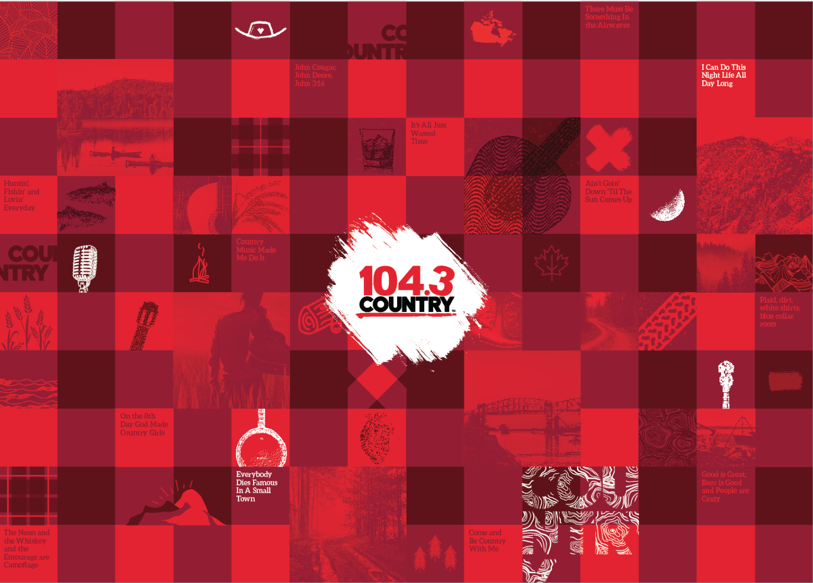
Country Radio - Nationwide Rebrand
Rogers’ national radio chain of Country radio was in need of a complete rebrand. We couldn’t change the logo design that was the same for each station except for the station number - but the previous identity needed some new life. It needed to reflect the increasingly young and hip country music stars and the way country music fans saw themselves - specifically Canadian through and through. The usual tropes of American cowboy hats and boots didn’t fly - this needed to feel 100% Canadian. The team researched, listened and dug deep into the world of country music to getter a big picture of who they were. What emerged was an updated plaid - or quilt that interwove story, landscape and a simple lifestyle in a new and modern way. We included country lyrics, Canadiana and every station got unique images of their hometown and landscape. The new brand had the flexibility to employ the full plaid or the more open version wherever it worked best.


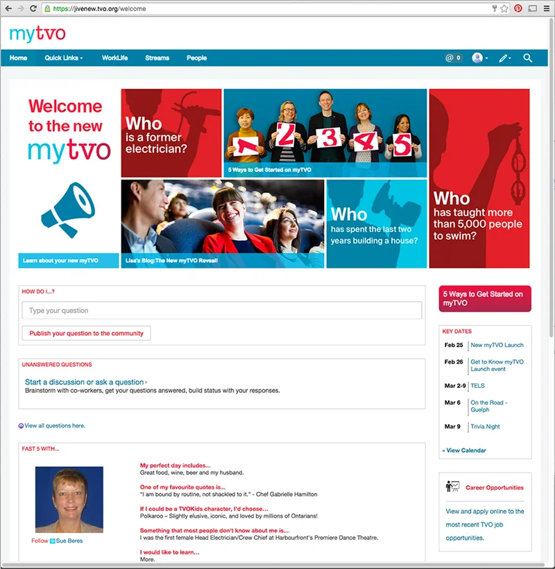
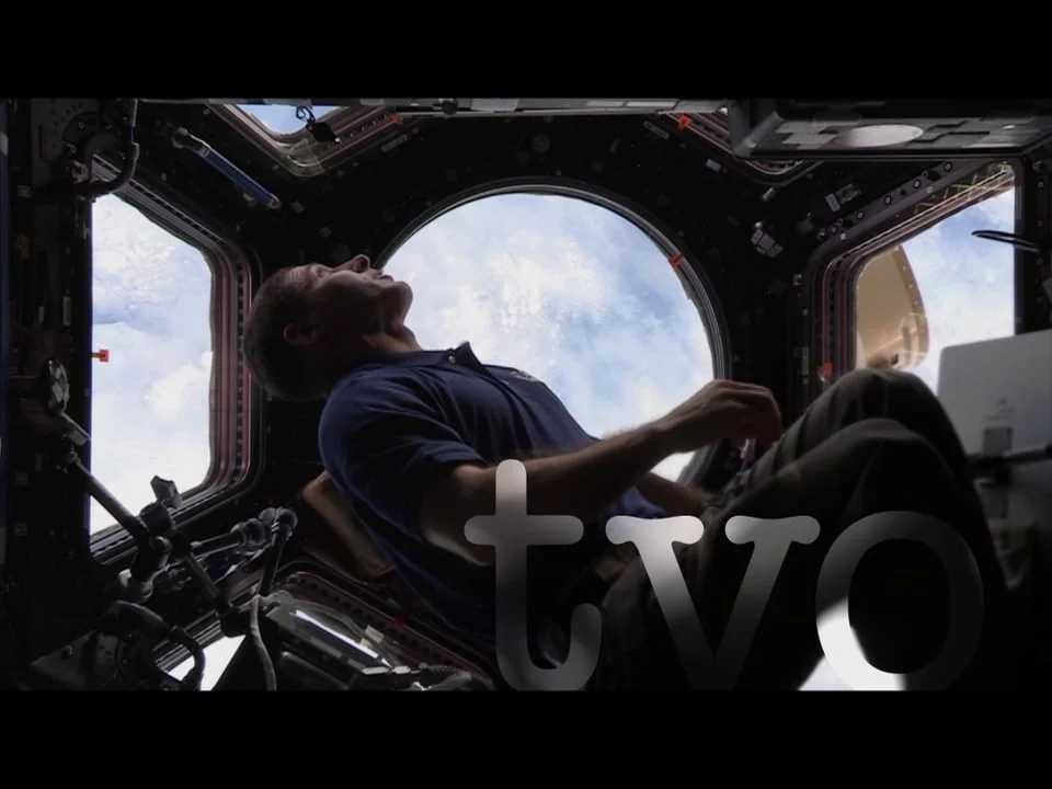
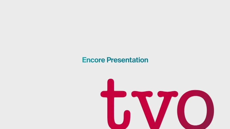
TVO
TVO is best known as the public broadcaster that's been a part of Ontarians' lives for over three decades. As they transition from being just a broadcaster into a leading provider of digital education tools for Ontario, they needed a complete rebrand to signal their new direction and change within the organization. Their previous look was dark, serious and generally lacking in any brand personality. The new approach embraced white space, a larger than life logo and evocative imagery. On broadcast the idents and all elements were updated to embrace the new personality—which included new voices, music and approaches to motion. Walls and boardrooms throughout the company were also given a makeover, and in some cases expanded on the new tagline "never stop learning" further. - 2015 HOW Magazine award winner for identity


TVOKids
The kids' brand was overdue for a re-haul, and had to fall more in line with overarching TVO brand. The logo was reworked using the tvo wordmark but also employing bright, energetic colours while also keeping the white background. In order to ensure the brand was still fun and relatable for kids, we developed a series of icons that speak to the education parts of the brand, and developed an animated version of the logo for on broadcast and for future digital applications. RGD award winner for brand


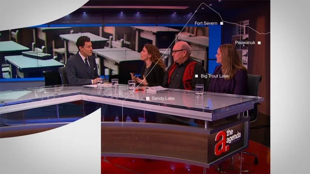
The Agenda with Steve Paikin
For its 10th anniversary, and because of a generous bequest from a donor, the well-known Ontario current affairs show got a much needed refresh. The set, tone, show construct and even Steve's suits were modernized. I was on the team to help bring the show into a more current space as well as ensure it dovetailed with the new TVO brand.


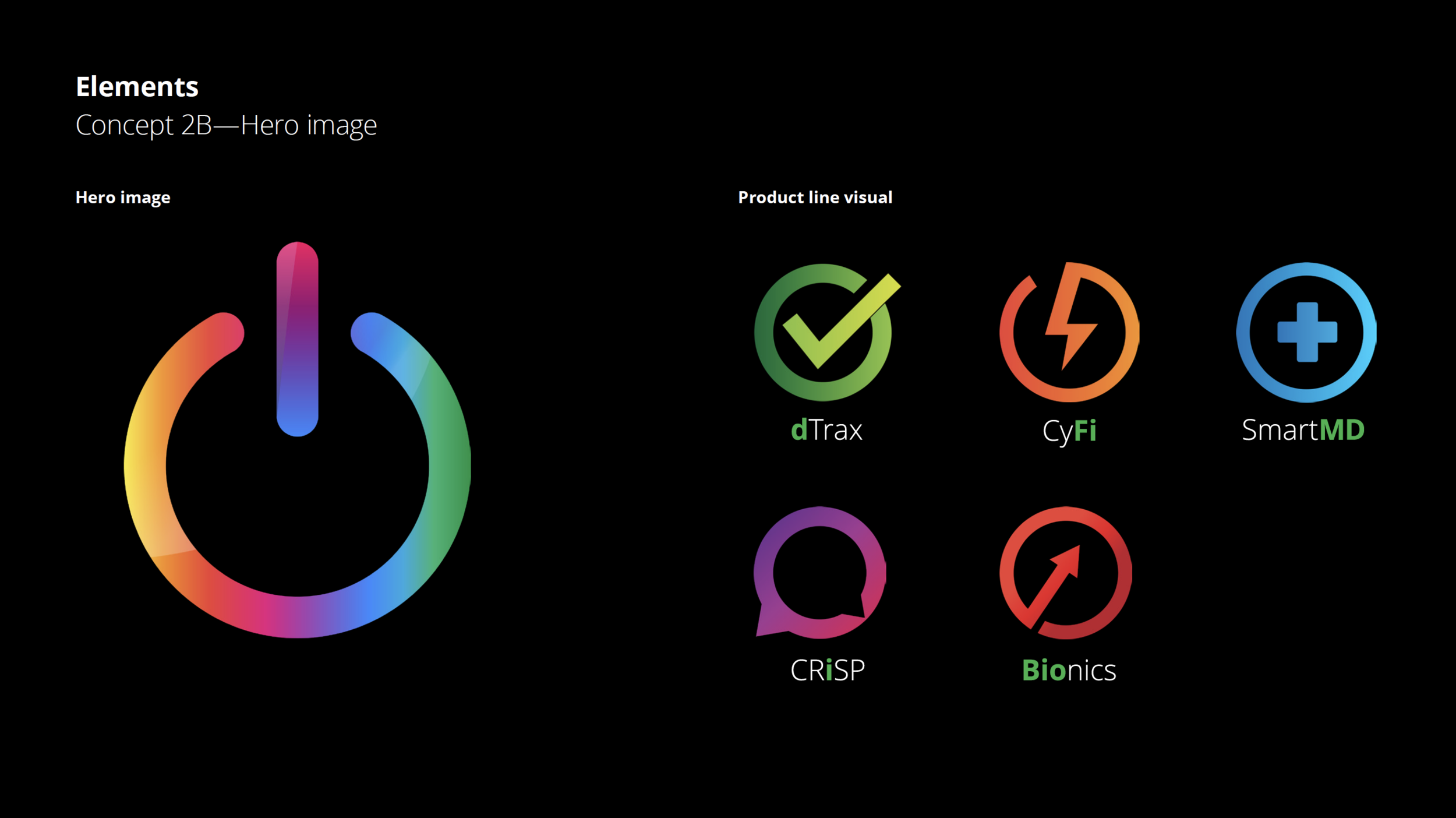
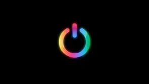
Omnia AI Factory
The Omnia team came to us to help promote their AI products. Their current look was a little soft and didn’t speak to the breadth of products they had as well as more that were in development. We did an competitive analysis of their products and brand and proposed to completely rehaul the entire portfolio - new brand system, new product family visual identity, the product pages were completely rewritten and we produced short and informative animated videos to help sell their products.


Empower
A vibrant and fun brand for online gamefied learning products - for both teachers and students. The logo had to appeal to both the adult and the child with the right feeling. It is always animated whenever possible.
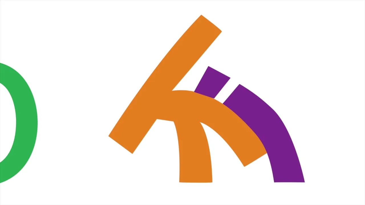
Current Affairs - Narrative Themes
We developed new logos for the different streams of editorial that were coming out of Current Affairs. They needed to be quick to recognize, understand, animate and function as an identifiable series.

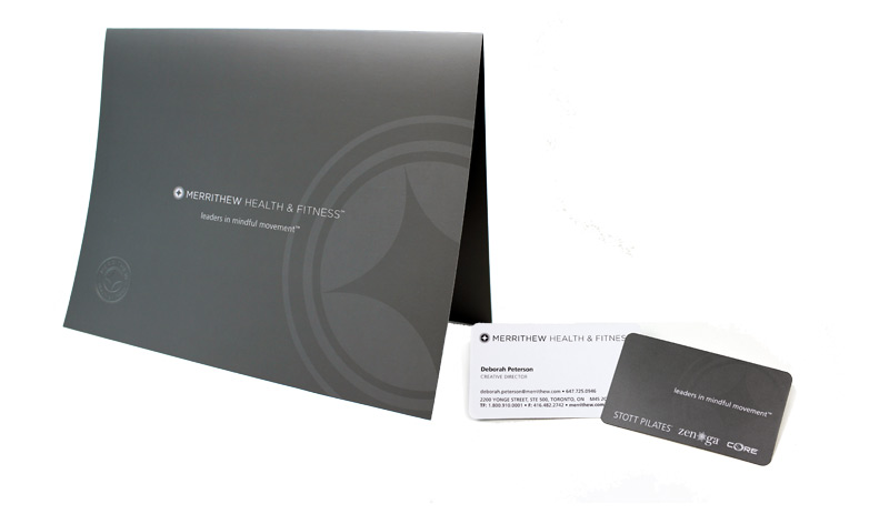
Merrithew Health & Fitness
Merrithew Health & Fitness were growing as a company - new brands, new forays into retail and a dated image. Their blue 3-D logo was replaced with an understated grey one, reset and in a new font to better address their elegant image. New imagery was also developed, as well as an "icon" from the logo for use in product design as their symbol, much like the lululemon symbol.


New photo library developed


Harlequin Enterprises
Harlequin needed to break the idea that they were just meant for grandmas and shut in's. They wanted a vibrant and modern look to their series romance books. We developed an entire strategy including new fonts, colour, a signature pattern and new photography library.


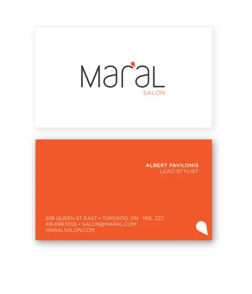
Maral Salon
Maral Salon was a new start-up by a hairdressing couple. They were located in trendy Leslieville and wanted their new salon to have an urban, hip, but still down-to-earth and friendly feeling.


STOTT PILATES Studio
Refreshed brand colours, imagery, typography to coincide with new studio launch. Website forthcoming.
